
Trive
Group Planning and Journaling Social app
Challenge
Design a social media app that systematically help groups plans and record their trips
Roles
Product Founder
UI/UX Designer
Personal Takeaways
Create intuitive and efficient user flows that reduce friction and make planning feel effortless
Drive users to post, interact and contribute actively within the app
Timeline
1 Month
Responsbilities
user research
Interface and interaction design
Prototyping
Tools
Figma
Project background
As college students, we love going on trips with friends, but we realized one big problem: Planning trips with a group is so chaotic! Communicating back and forth and coordinating everyone’s ideas is hard.
Trive aims to optimize the group trip experience through combining spot recommendations with idea organization. It provides a collaborative board that streamlines the group decision making process, collecting and sorting ideas and provide an intuitive, centralized space where ideas are well organized and easily accessible.
Discovering and diving into the problem
The problem: ‘We can never make it out of the group chat!’
People told us that group planning is always super chaotic and too much effort. But what exactly makes it so hard?
We conducted user surveys of 50+ and competitor analyses to dive into the problem:
User Research
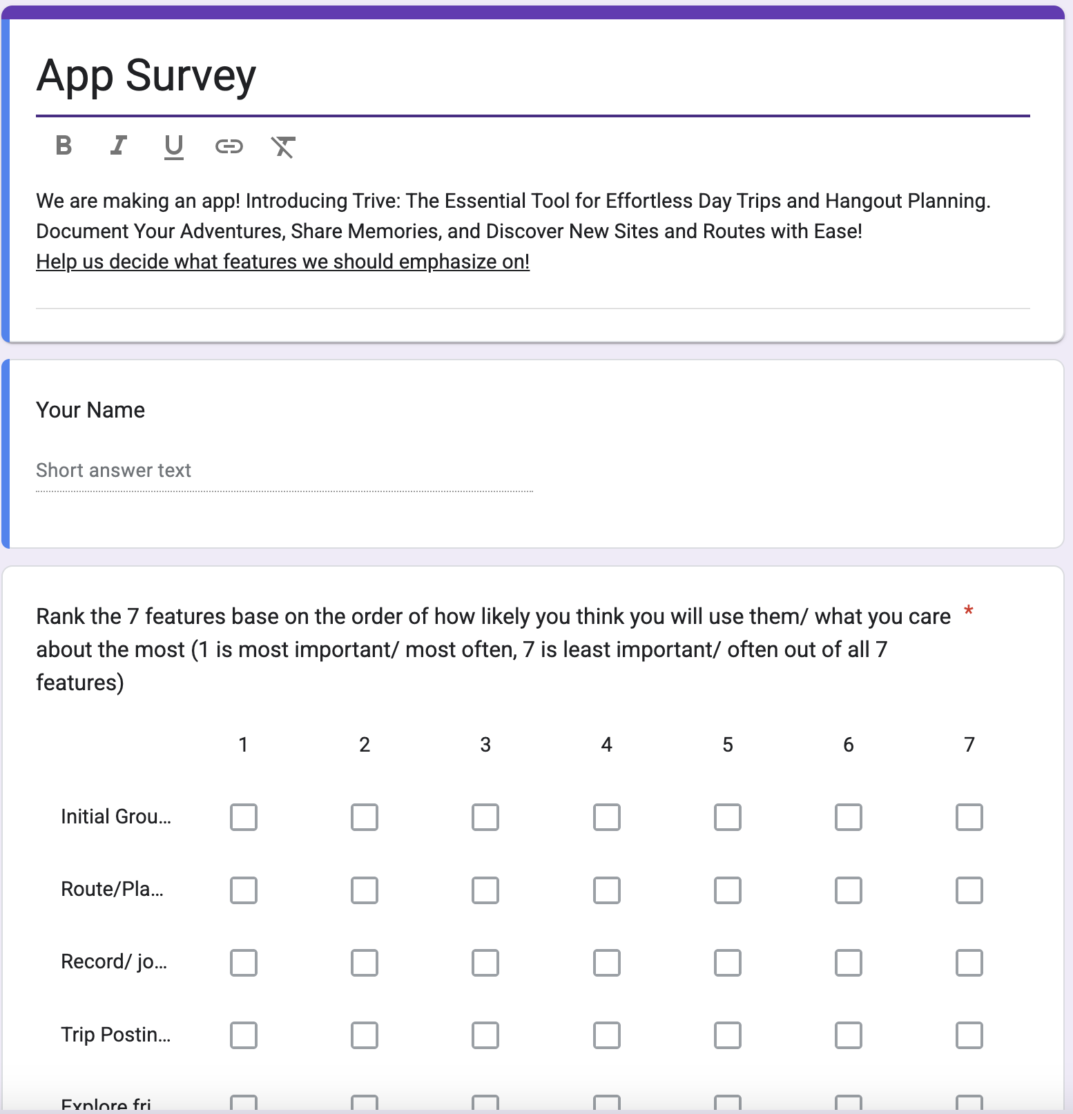
Pain point 1: There’s too much travel info out there, and organizing everyone’s ideas is a mess
Planning group trips involves endlessly searching for good places to go, then coordinating and organizing people's ideas. Users struggle to figure out what is the best route to take, and the best way to divide their trip.
Pain Point 2: Detailed Planning is too much effort
While there are many apps out there offering detailed travel planning function, college students are too lazy to fill in every detail of the places we are going, time, number of people etc.
Pain Point 3: Hard to keep track of places visited and the memories made
Post trip, users want an easy way to save and access the places they’ve been and document their group memories
Reviews from competitors
Can’t organize and sort potential ideas
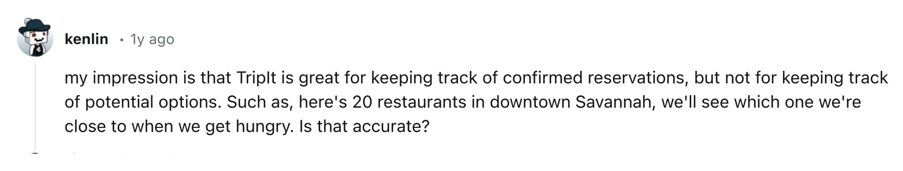
No place to save trip details and memories

Lack of planning platform

Limited in creating location list

Finding Summary
we found that
Idea organization
Finding places to go
Trip details documenting and accessing
are the top 3 demand when it comes to group trips
Ideation
Developing Strategies
To solve these three problems—and make the product both sustainable and business-worthy—we reimagined the planning app as a social platform. This approach helps tackle the pain points while creating opportunities for ongoing engagement and growth.
By turning the app into a social platform, we create a product loop: users find authentic spots and routes suggestions directly within their network, collaborate through a centralized planning hub, and document their trip through quick reviews or posts. These posts are then recycled into their network as future planning references for others and themselves.
This approach help make every part of a group trip easier while transforming the app from a one-time planning tool into a dynamic, community-powered product that grows with each trip.
With the flow in mind, I laid out the product logic and user journey flow:
Thinking through each stage of group planning that users struggle, I divided the app into 5 main parts.

Ideation: Users discover authentic spot suggestions through the Explore and Friends pages
Planning: Under Trips, users create collaborative trip boards where ideas are put in one central place
Organization: Under the Planning page, ideas can be sorted by category, location, or other filters to quickly understand group interest and plan efficiently
Documentation: After the trip, users can easily revisit trip details, rate their expeirence, and upload photos under Profile
Sharing: Posted trips will appear on the Explore and Friends pages, creating a continuous cycle of inspiration within the network
Wire framing & Iterative design
My wireframes helped the team test their vision and quickly identify underlying issues with game logistics.
Low fidelity
After knowing that it would be a friends driven
Iterative design


Before
After
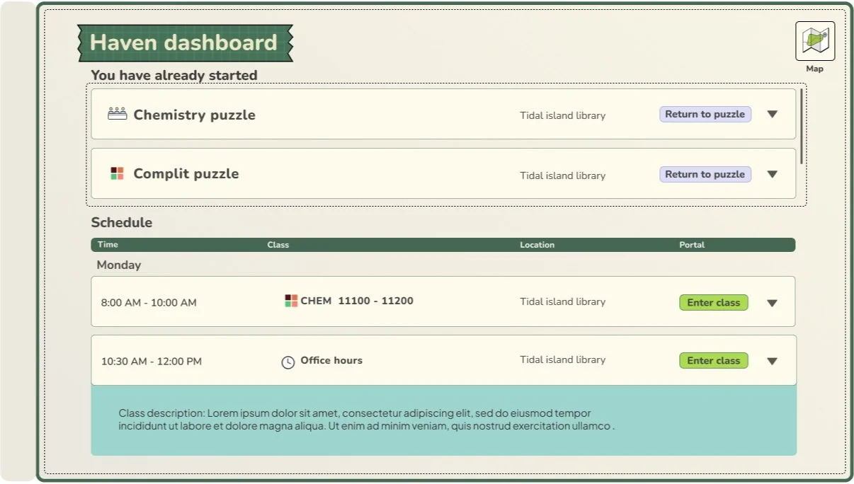
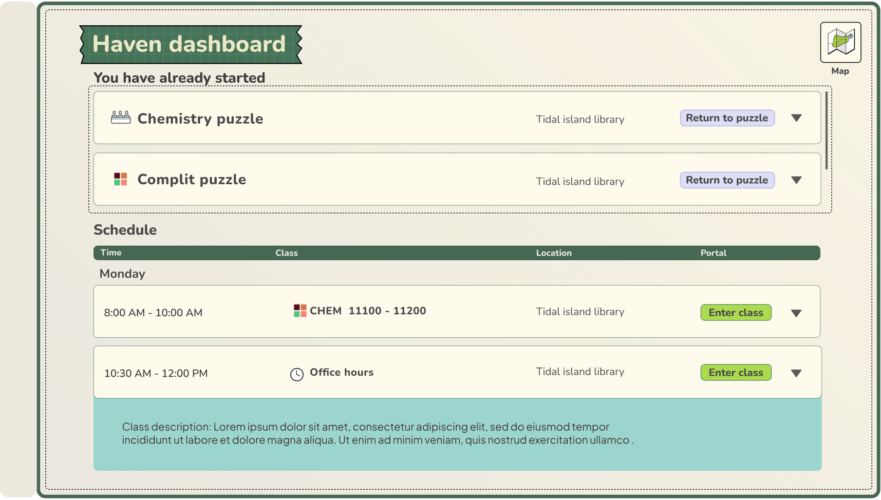
Example: After testing, we identified inefficiency within the planner system.
As a solution, I transformed the planner into a Dashboard, enabling new features such as quickly accessing old puzzles and improved clarity to differentiate puzzles and office hours through icons and additional information.
Setting design guidelines
Having estbalished clear understanding of the characteristic and personality of each island, the character designer and I worked together to deliver a style guide to align visual visions across the art team and the rest of the team. This enables the team to work simultaneously on different parts of the visuals.

Multiple aspects were considered:
From the player's perspective: we selected a style suited for college students.
From the team's perspective: We factored in the narrative context, time limits, and artistic style differences.
All visual elements were considered to complement and work together as a whole.
Solution & Outcomes
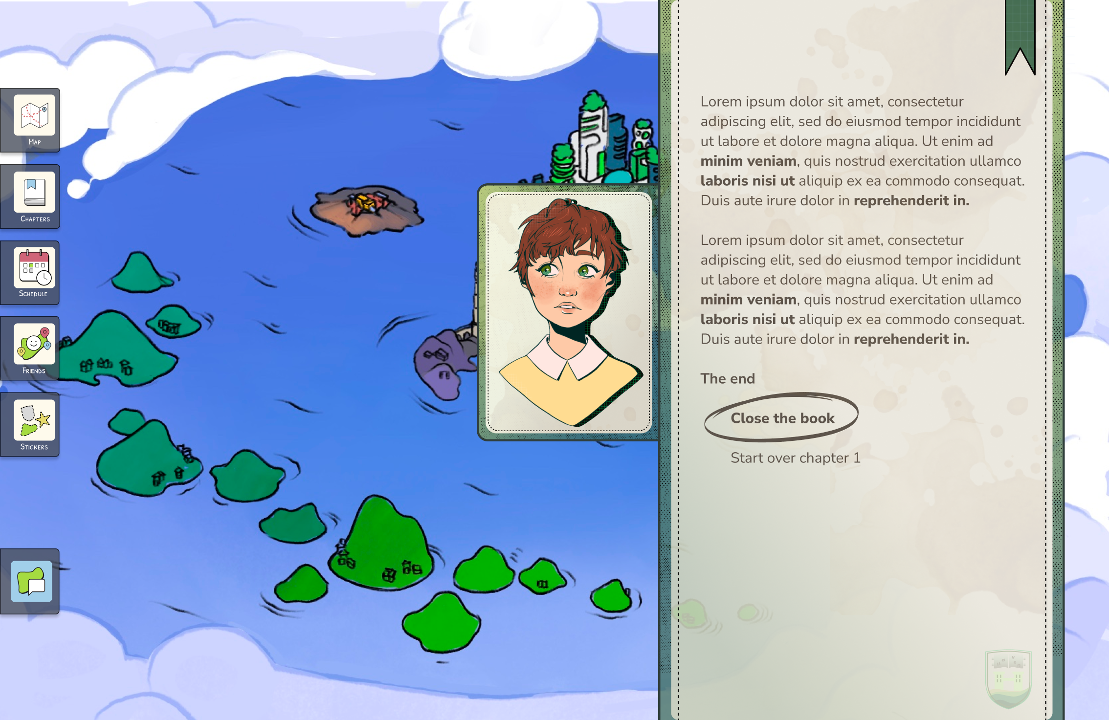
Strategizing game interaction system-The notebook hub
I created a notebook system that acts as a central hub facilitating game navigation, boosting user motivation and ensuring cohesive story telling, tailored for specific functions for each chapter.
Chapter 1&2 notebook system-Game introduction (Sound On!)
The notebook in chapter 1 & 2 acts as a platform that allows users to set up their profile, fostering a sense of personalization & facilitate Chapter transition.
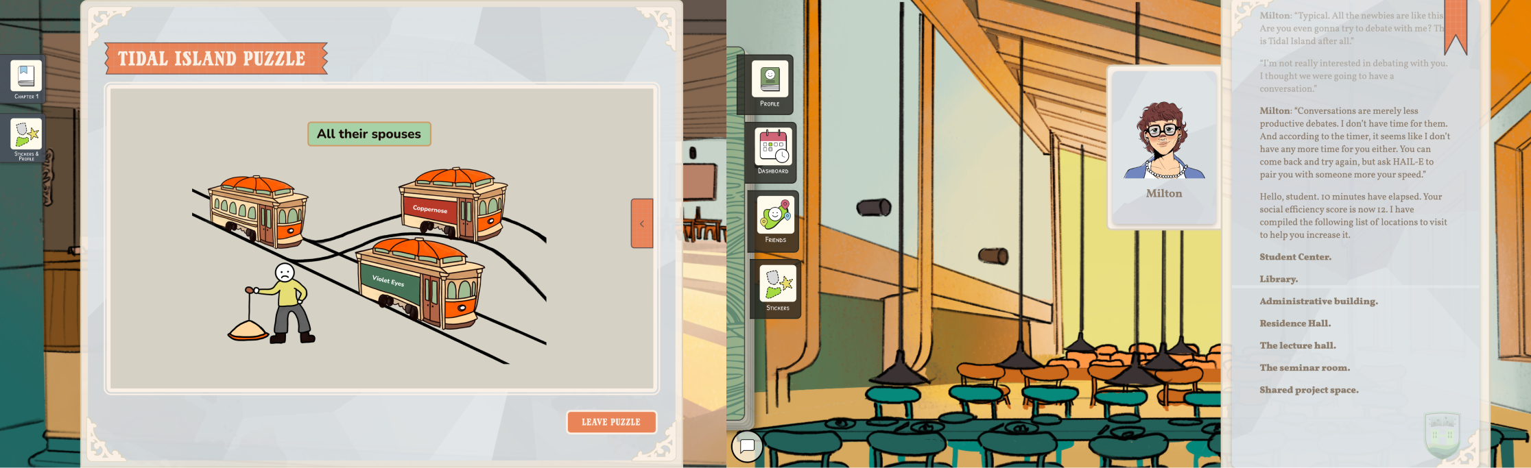
Chapter 3 & 4- Puzzle Solving and Exploration
When island exploration, puzzle solving and collaboration are the emphasis, the notebook turns into a central tool box that enables quick access to the puzzles & friends.
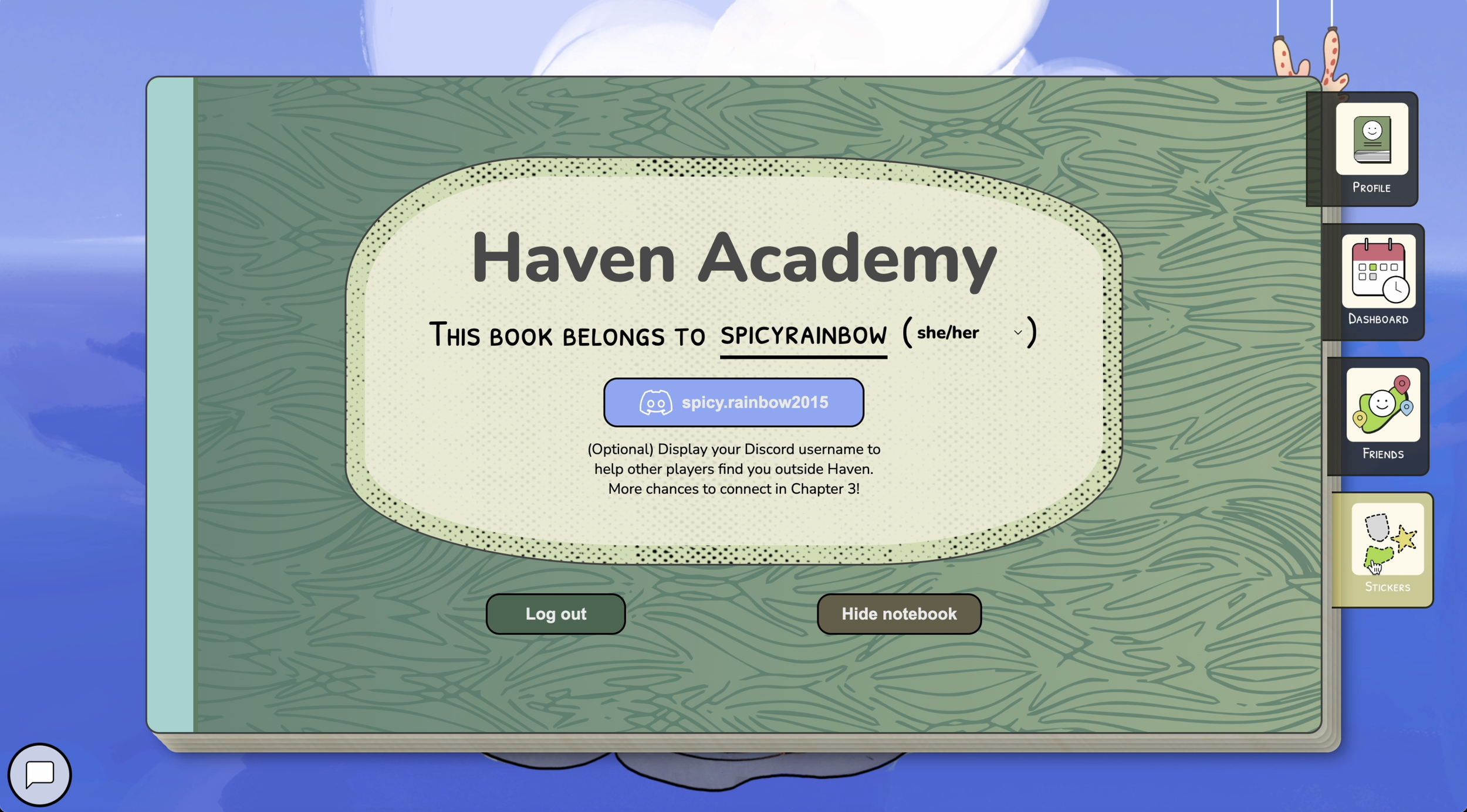


The Notebook as a system:
Improves player navigation accessibility: Acts as a central place where players can easily navigate between specific puzzle games, connect with friends, track progress and more.
A flexible concept that allows further iteration if a new function is needed later on
Easy to follow-A concept highly familiar with students which can facilitate their ease of understanding the system
Conceptually, a storytelling tool that enhance gameplay immersivity :
A notebook seamlessly merges with the academic setting and chapters format and context, emphasizing UChicago's spirit.
Giving students their own notebook personalizes the experience and enhances their sense of belonging.
The sticker system-boosting player motivation and engagement
As part of the notebook, I designed a sticker systems that acts as both a progress tracker and motivation trigger to encourage continuous game play and puzzle completion.

The sticker system targets the player’s curiosity by displaying the silhouette of the sticker, making continued game play more rewarding.
Display of progress boosts completionist drive, enhances puzzle solving motive.
This was proven effective as we saw continuous collection of stickers across all users and from direct player feedback we’ve received
Designing the narrative interface
Another essential part of my role in the project is designing visually attractive and cohesive interface and elements across the game, including logos, icons and web interface layouts.
The interface is purposely tailored to achieve these goals:
Optimized for a horizontal, laptop web-based layout flexible that accompanies for most screen sizes
Balanced visual hierarchy that highlights the background art without letting it overshadow key content
Text containers designed for reading area optimized for 50-100 words, ensuring readability and user engagement.
Coherent and vibrant visual designs that ensures user engagement and immersive storytelling
Optimizing text box layout
Referencing similar text based game like Disco Elysium and testing, I found the optimized text layout.

The majority background is covered up and the text becomes less readable

The background can be seen but the text box is not suitable for longer texts
Outcome

More optimized background and text balance and clear readability for the desired word count
After standardizing the basic layout, I designed high-fidelity narrative interfaces reflecting each island's distinct characteristics, following design guidelines shown earlier.
For Chapters 1 and 2 for instance, I incorporated notebook-inspired elements like ink splashes and bookmarks to reinforce the narrative of the island’s academic and notebook theme.
Interface highlights
I designed and optimized the narrative and puzzle interfaces to align with the game illustrators' style, while reflecting each island's unique characteristics and narrative.
Coral Island-The Arts

Tidal Island-The Social Sciences
Artificial Island-The Math and Sciences

Oceanic Island-The Humanities

Beyond interface designs, I also illustrated a series of art and puzzle assets:
