
Vitals
A Health Measuring & Coaching ios App
Challenge
Turn a simple health measuring technology into a dynamic, consumable product for daily users
Product Manager
UI/UX Designer
Roles
Data and Information Visualization
Build User Retention and Habits
iOS App Development
Product Branding & Onboarding
Personal Goals
Timeline
2 Months
UI/UX iOS design
Data visualization & information architecture
Wireframes & prototypes
Competitor analysis
Responsbilities
Tools
Figma
The company focuses on digital healthcare and wellness by turning any camera-equipped device into a body vital signs monitoring solution. HealthyPAI's video-based software eliminates the need for wearables and delivers medical-grade vital sign measures remotely or on-premises.
The challenge:
Originally a B2B product, integrated into other products like insurance services and taxi apps that demands health monitoring, the company now aims to create a direct-to-consumer product (B2C). As a product manager and designer, my role is to adapt and expand the technology into a valuable, standalone product for consumers. The main business objective is to turn the product from a pure health measuring tool into a powerful health assistant that helps users live a healthy life style and form healthy habits.
Project background
Process highlights
User & market Research
We have the technology, but how can we turn a tool into a valuable, consumer facing product?

I dived deep into user and market research: conducting interviews, collecting existing user feedback, and user testing with our original product in order to discover what is truly valuable to users

User Persona
I identified 2 target user personas based on existing user database and user interviews to help me discover specific needs and pain points of each user group
Beyond individual person’s needs and pain points, we also discovered the 2 biggest pain points that applies for all users:
Skepticismtowards the credibility of the measurements even though the technology is clinically proven
Loss of motivationto track and measure their health regularly
We dived deeper into the problems, what exactly caused these issues?

I conducted user testing with the original software and user interviews to map the end-to-end journey, in order to pinpoint the roots of specific pain points and uncover unmet needs at critical touch points.
Through walking over every step:
1.I discovered the touch points that drove the lack of trust and loss of motivation
2. The core needs of users at every part of the health monitoring process
Competitive analysis
To validate my findingsfrom user journey analyses and uncover gapsin user needs and market opportunities,I explored how existing solutions approach core functionality and where our app could deliver greater value and maximize impact.

Key insights
For apps that uses similar technology (direct competitors): Many apps explain vital signs data poorly making health data overwhelming, and few make efforts to build user habits.
In comparison, successful fitness/ wellbeing apps: puts heavy effort on functionalities on habit building and boosting motivation.
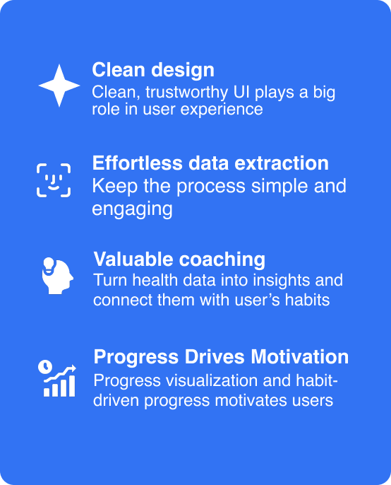
Through in-depth analysis of user motivations, pain points, and validating essential functions, I established our core design goals and product functionalities to build trust, drive user motivation, and designing for real user needs
Synthesis

Ideation
Mapping out the user flow
After competitive research and clarifying my goals, I gained a clear idea of the main components of the app. I created a user flow map that lays out the structure, feature and content involved in each component, which was later further optimized to ensure objective of the app is achieved.
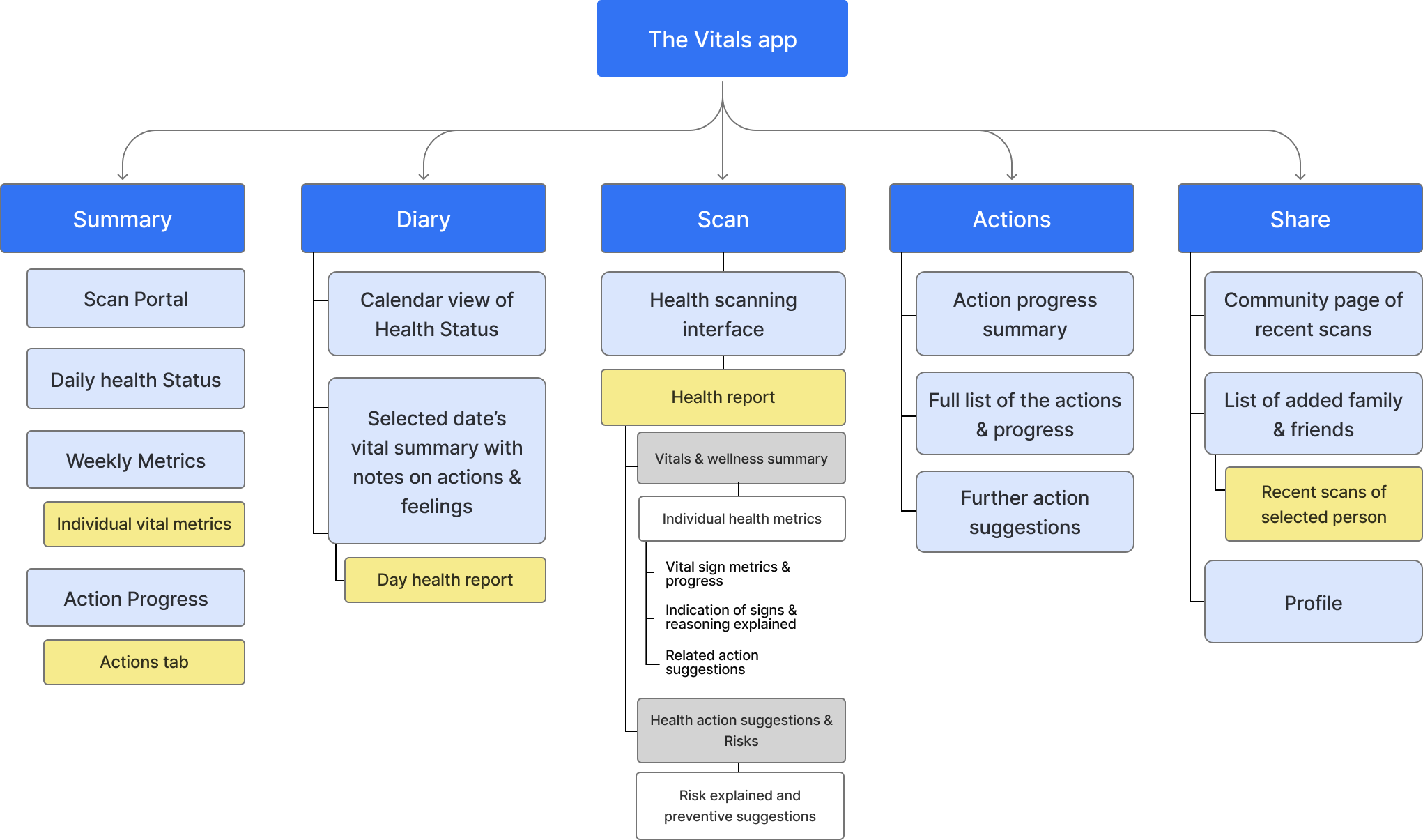
The summary visualizes user health metrics to ensure acessible health data and motivates user to do health scans
The Diary is another way to make health progress more comprehensible and personal by linking real life journaling with health stats
Scan is the main portal to the vitals sign measuring technology
Action focuses on forming user habit to boost long term tracking and user retention
Share aims to allow users check on health of others they care about while boosting user engagement
Wire framing & Iterative design
After defining key features and basic structure of the product, I developed mid-fidelity wireframes using figma to visualize the user flow, enabling me to quickly identify potential issues with key features.
Early Mid-fidelity wireframe

Iterative design-Optimizing data visualization & information hierarchy
A challenge I faced was improving data visualization and information hierarchy to support the product goal of boosting health scan frequency and health actions.
Through mid-fidelity wireframe testing, I streamlined and refined the information hierarchy and display to enhance information clarity and app usability.
Key improvements includes placing a prominent face-scan button on the landing page to encourage health scans and optimizing the dashboard to display clear, actionable health metrics alongside consistent calls to action.
Through these wireframes, I was able to pinpoint areas for improvement in information visualization, driven by the goals of comprehensive accessible user experience.
Introducing my Solution
App branding Through Storytelling
Beyond focusing on functionality, I also paid attention into creating a cohesive app identity. Specifically, my design choices are driven by the goal of enhancing app credibility impression while creating a comfortable user experience.
I took aesthetic inspiration from high credibility platforms like Health/hospital and Banking websites and apps.

High-Fidelity Interfaces
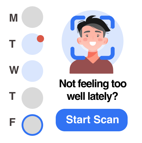
The face scanning interface
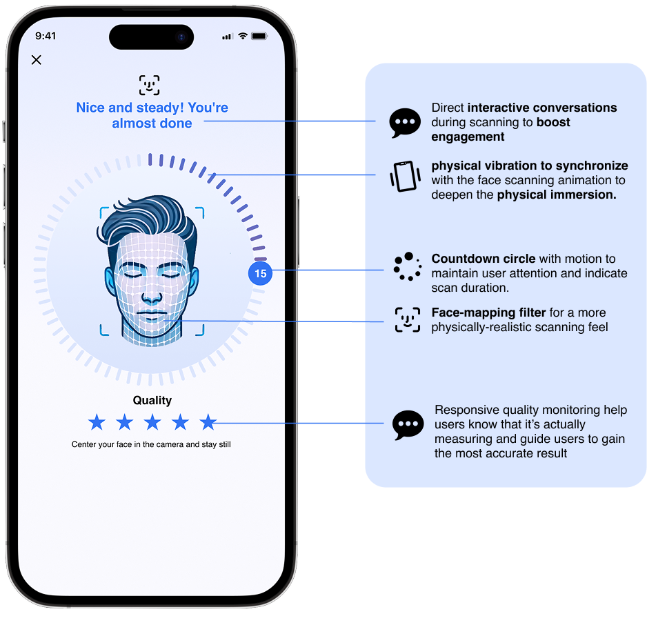
Improving credibility & user engagement through a physical health Scanning experience
Home page

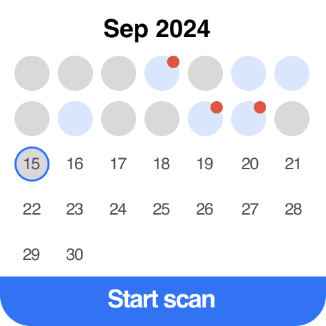
Boosting User motivation & retention:
Emphasize health progress and habit goal display to create a rewarding experience that encourages consistent health monitoring.
Accessible Information Architecture: Overwhelming data also discourage users!
The information architecture is constructed to give a clear, simple overview of user’s health progression and highlight abnormal values.

Health Diary
To further motivate users, fostering a personal connection is key.
The Diary feature enables users to link their real-life experience and activities with their health data, enhancing user-app interaction.
Widget Design
I designed widgets to further drive user retention and motivation through showing urgency and sense of progress.

Clear and comprehensible Health Report
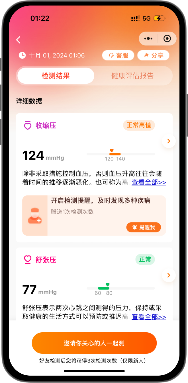
The original B-type product displayed vital signs in list form, the long scrolling makes data overwhelming and hard to grasp quickly.
To streamline data comprehension, I optimized the system to a data table where users can gain a clear overview of their vital signs and linked them to secondary pages that offers deeper insights.
The Action feature: Forming User Habit

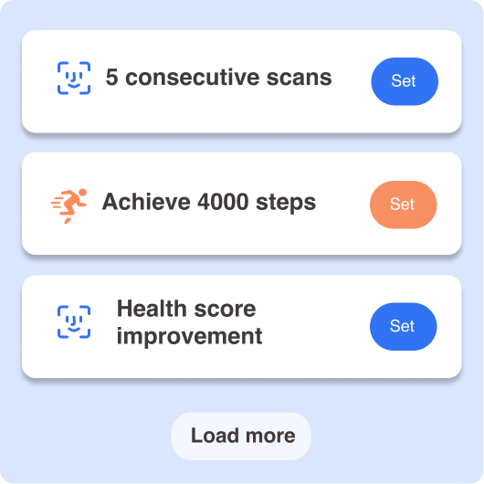
One main feature of the app that differs it from the B-End product is the Action feature, we are making a product that is beyond a static tool, but an interactive experience.
In order to form user habit and retention, we want to take health monitoring one step further from enabling users to simply understanding the data, but actually make actions for them.
Suggestions and actions are provided throughout the interfaces in direct relation to user’s health data, offering a more personal experience.
For the launch of the app, I also managed the copywriting and design of the initial onboarding graphics and content to highlight key features & functions
App store description

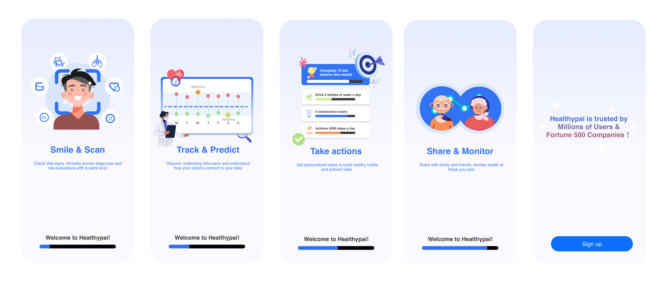
New user onboarding
Reflection!
Conduct more testing and interations of design after the product is fully built
Explore further in depth on how to build product growth through forming user habits using UI/UX
Wishes
Takeaways
As a product manager:
It’s important to come back to user experience and dive deep to discover the root of user painpoints
Product manager’s role is not just solving expressed user needs but also uncovering and delivering hidden value users didn’t know to ask for
As a product designer:
Creating a clear sense of progress and reward is key to driving user motivation and retention
Data is only meaningful to users when their indications are showned
Optimize information on a single page, too much information will immediately overwhelm and demotivate users
Small interaction improvements can make big impacts on trust building and make technology feel more personal:)
Keeping key product and business objectives in mind is important when making all design decisions from function hierarchy to visual interface design